plotly 라이브러리를 실습할 것이다. PyCharm 환경에서 진행한다.
1
2
3
4
5
6
7
8
9
10
11
12
import csv
import pandas as pd
import plotly.express as px # 시각화 라이브러리

data = {
    '20대남성 유입인구': [2.23, 2.75, 5.62, 0.8, 1.04],
    '30대남성 유입인구': [14.09, 4.91, 2.76, 2.56, 0.64],
    '20대여성 유입인구': [5.95, 0.44, 2.79, 2.08, 0.57],
    '30대여성 유입인구': [5.69, 2.14, 2.61, 2.38, 0.56],
}

df = pd.DataFrame(data)
데이터는 생성된 예시 데이터를 넣어본다.
1
2
3
fig = px.bar(df)

fig.show()
Bar형 그래프를 그린다. 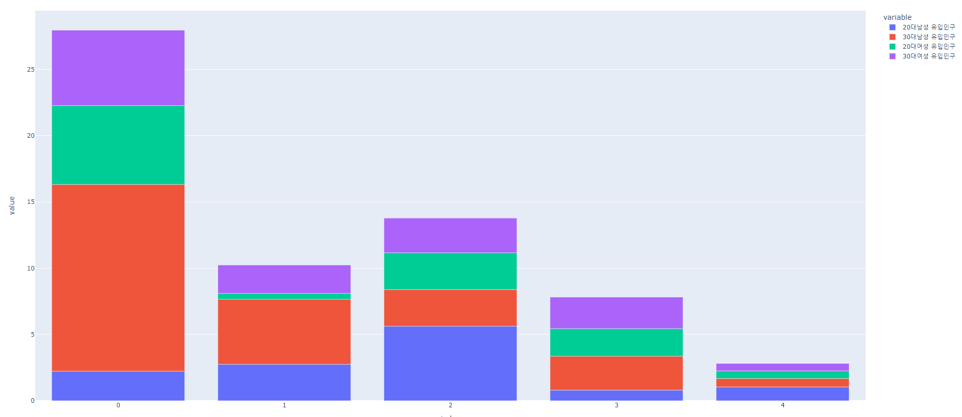
1
2
3
fig = px.line(df)

fig.show()
선형 그래프를 그린다. 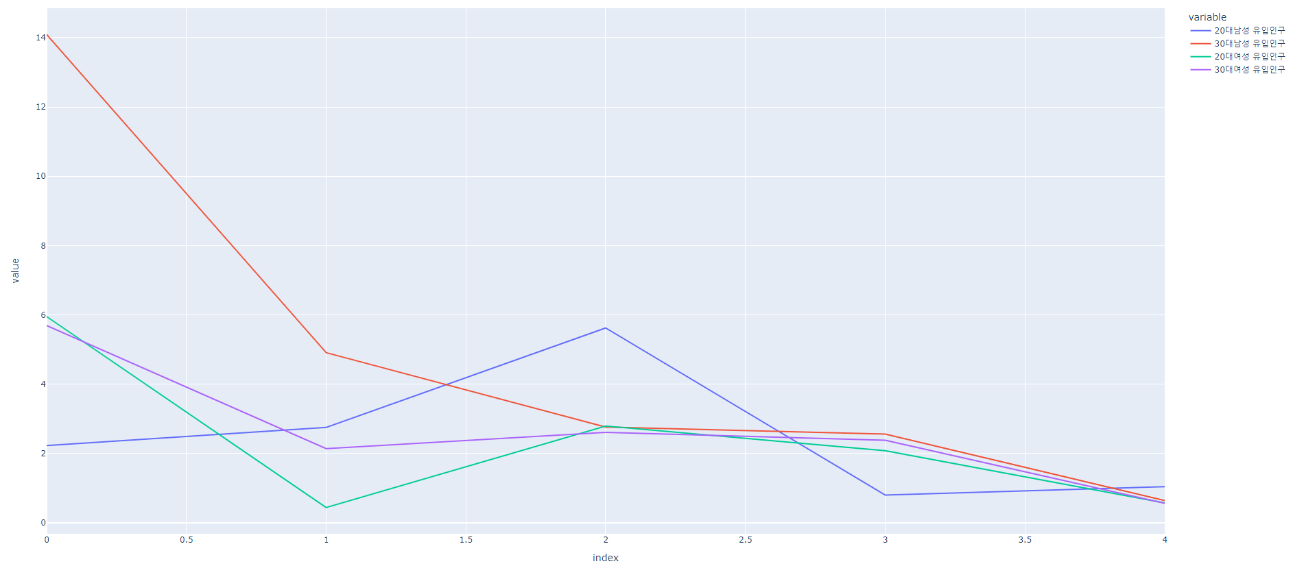
1
2
3
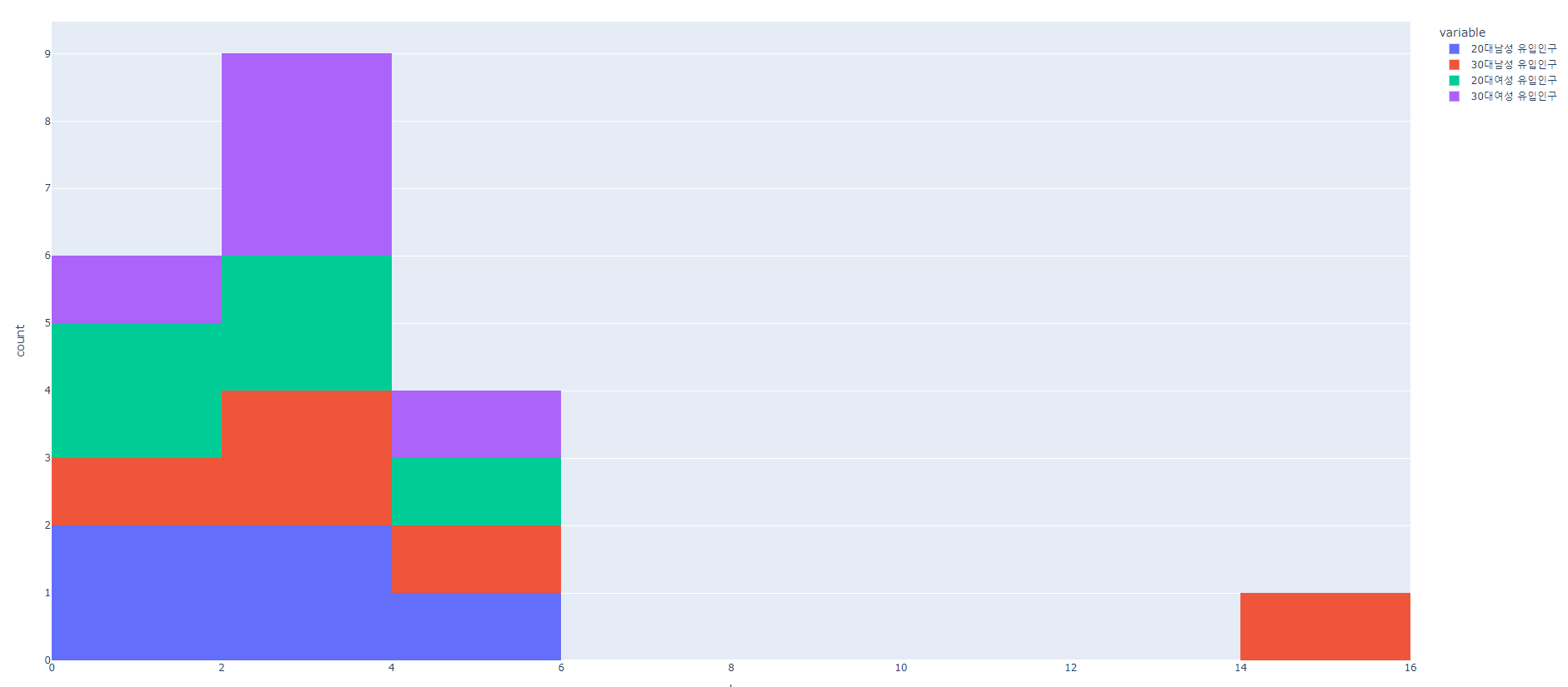
fig = px.histogram(df)
fig.show()
histogram형 그래프를 그린다.